Meijer
Design System
In an age where enterprises increasingly rely on complex software applications to drive their daily operations with highest possible efficiency, the need for a cohesive and user-centric design cannot be overstated. At core is the design system, a blueprint that shapes the way users interact with digital products.
My journey began with a fundamental question: What does it take to create a design system that resonates with the unique requirements of Meijer? The answer lay in our commitment to innovation, collaboration, and user-centered design principles.
In this case study I was take you through the key processes and outcomes from this project.
Purpose and goals
Align our teams by giving them a more structured and guided way to build products.
Speed up our design and development process with a ready-made library and patterns, where teams can create and test layouts much faster.
Promote accessibility of our products by building accessibility into our system, both from a design and code repository perspective.
Enabling the workflow for design across the application that is easy to learn, and quick completion of tasks for the people who do certain set of actions all day everyday.
Buy-In
In order to ensure the success of this project, it was important to get stakeholders on board before we start building our design system.
We systematically promoted the initiative via:
A kick-off company-wide presentation where we shared the current pain points and the anticipated changes.
Involving engineering into the conversation early on through bi-weekly meetings and workshops to collect their input.
Sharing work in progress and the roadmap of the project with squads.
By getting other teams involved from the onset and as the project evolved, we strived to promote understanding of the project and inspire a sense of co-ownership throughout the entire process.
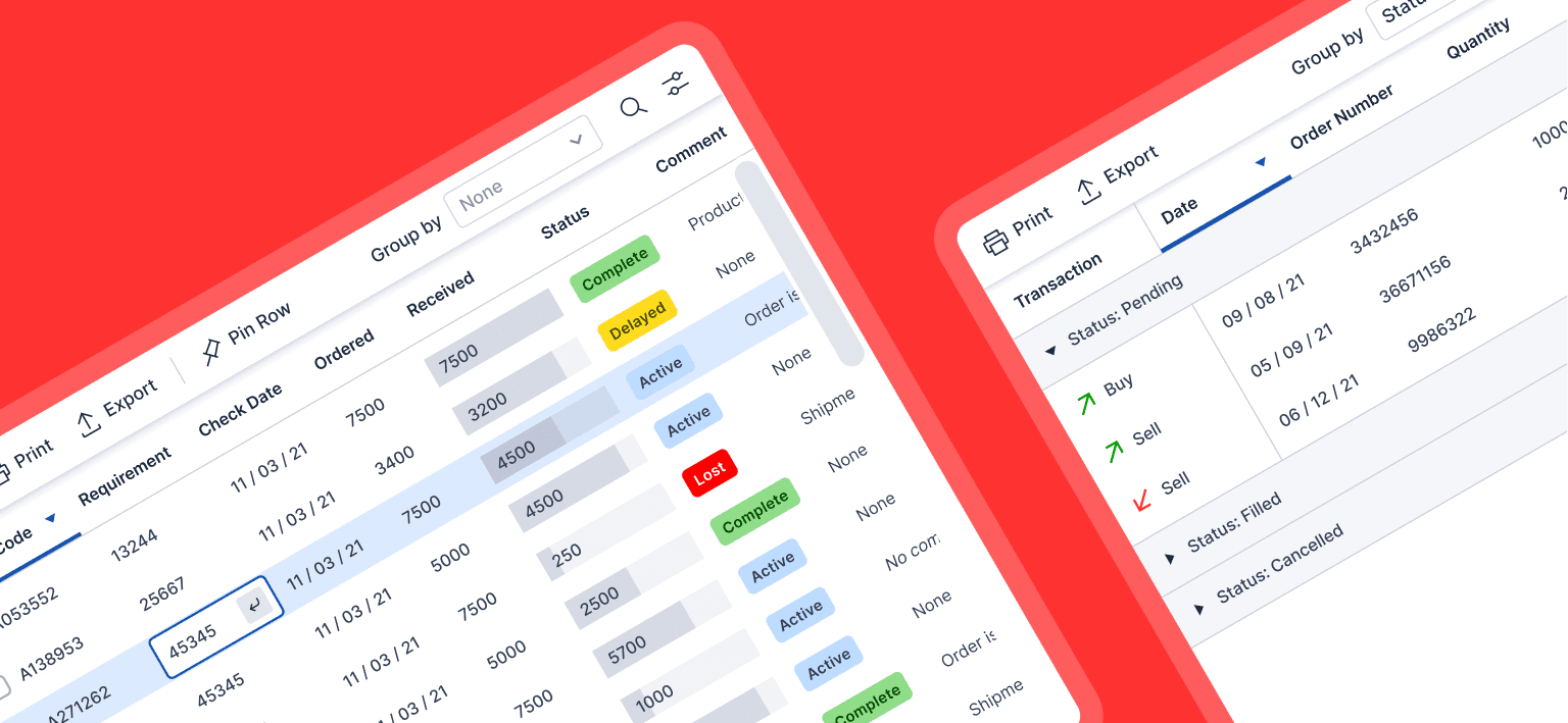
Design exploration
We decided to focus first on the foundational elements of our design system, such as thought, flow types, user types, and then move on to blocks and pieces (molecules, organisms, templates, pages). We created components from scratch since we switched from XD to Figma as it served our design needs better.
Some of the activities at this stage involved:
Researching other design systems and interfaces for components, common practices and inspiration.
Analyzing the instances and use cases captured during the audit and ideating on the solutions that serve our goals best.
Merging different variations of components to leave only the essentials.
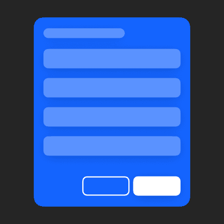
Interface cohesion
To make a complex system easy for the user to get used to, the concept of “Recognition rather than recall” is important. Once the mental model of the user aligns with a system, it becomes natural to understand how to operate it. For this to happen, one key aspect is consistent and cohesive interface and workflow. We structured this in following way:

Level 1: Application Flow
Ensuring a logical and intuitive flow through the application is crucial. Users should be able to understand where they are in the process, what they can do next, and how to backtrack if needed.
Level 2: Interface as a whole
A cohesive interface that maintains a consistent visual and navigational style is key. Users should feel like they're interacting with a unified system, not a disjointed set of elements. Dynamic behaviour is key part of this level.
Level 3: Patterns
Defining the hierarchy of the information and interaction by grouping components into patterns.

Level 4: Components
Individual components should have clear and intuitive labels or icons. Users should immediately understand their purpose and how to interact with them.

Level 5: Interaction Model
Defining and following consistent interaction patterns throughout the application with different inputs such as keys, mouse and touch.
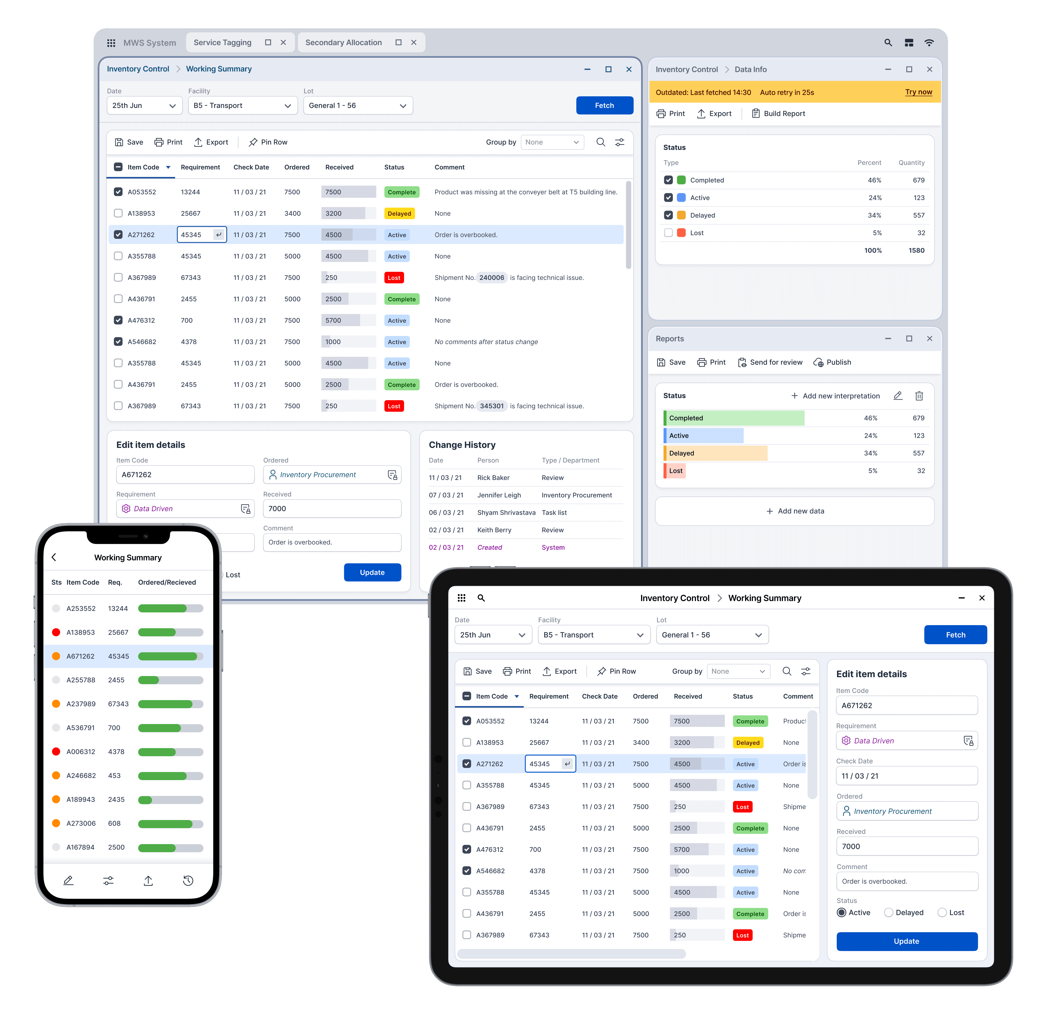
Application flow
To establish standardized application flows across a multitude of applications, we conducted in-depth research by closely examining the usage patterns of individuals in various roles across diverse applications using task analysis at different levels. As we discerned recurring patterns in user journeys, we organized these patterns into distinct categories. It's important to note that, quite often, a single application may incorporate multiple of these categorized flow types simultaneously.
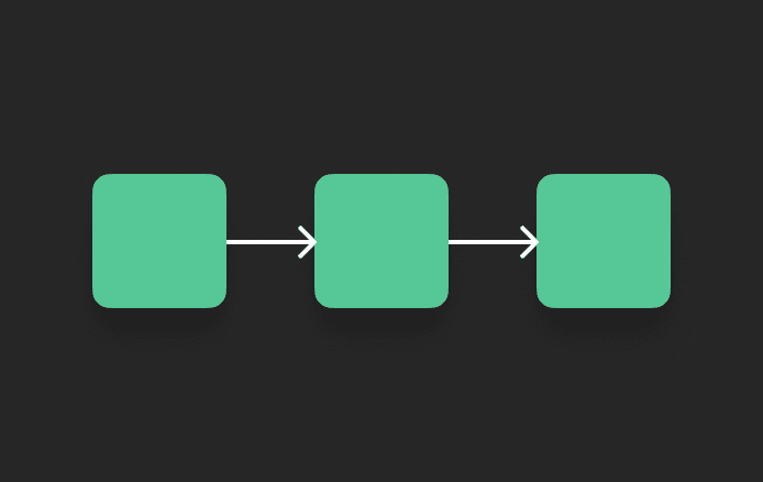
Linear Flow
Straightforward and follows a predefined sequence of steps.

Branching Flow
Involves user making decisions that lead to different paths within the application.
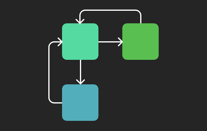
Circular Flow
Involves user revisiting certain sections or screens multiple times. Common in applications where users can to review and edit their input, such as filling a form.

Looping Flow
Involves repetitive actions or tasks, where users perform a series of actions repeatedly.

Parallel Flow
Involves user interacting with different parts of the application simultaneously. Such as a dashboard that displays multiple widgets or panels.
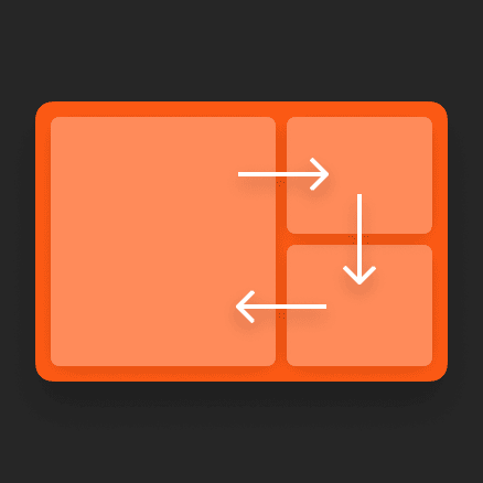
Dynamic behaviour
In the development of this design system, we encountered the challenge of accommodating over 120 different applications, each serving a diverse user base on a wide range of screen sizes and resolutions. The need for flexibility is key here, as a one-size-fits-all static design would inevitably break in various scenarios.
Key variables:

Multi-App Configuration
Many team members used 2-4 apps simultaneously on their screens, as these apps often had interconnected information and actions. This necessitated a design that could seamlessly adapt to such multitasking environments.

Different Display Sizes
Users in different roles accessed the same applications in vastly different scenarios and on a variety of devices. Our design had to be responsive to this wide array of screen sizes and resolutions.

Accessibility Mode
We also had to account for changes in various design components when accessibility mode was enabled. This required a robust adaptive solution.
Behaviour parameters
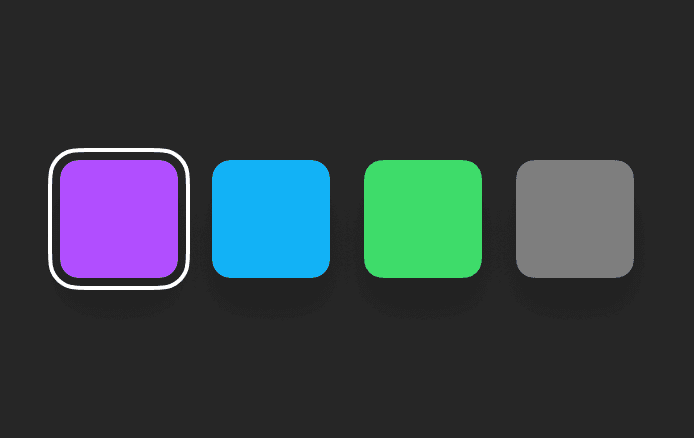
Priority
Components can be assigned priority levels, determining how they respond when space is reduced. Depending on their priority, components may collapse, hide, or remain unchanged.

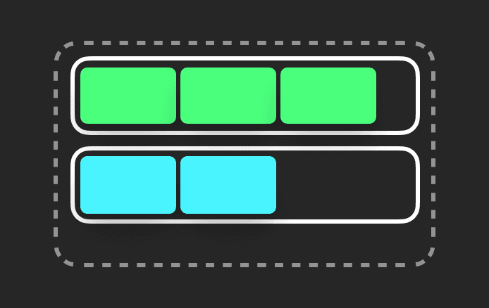
Space
Components can exist in various states that dictate their space requirements within a container. These states depend on how much space a particular component needs to function properly.
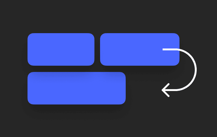
Wrapping
Dictates whether components will wrap to a lower position within the container when space becomes limited.

Scroll
In extreme cases where there's insufficient space to adapt content, the content occupies the smallest designated size, and a scroll bar is introduced on the container to access the content.

Position & Anchors
Components can be anchored either relatively or absolutely within a container. These anchors are maintained until a specific space threshold is breached, at which point the component breaks its anchor position.
Nesting
When components are nested within other components, they can inherit the same dynamic behavior as their parent component, which affects how they function.

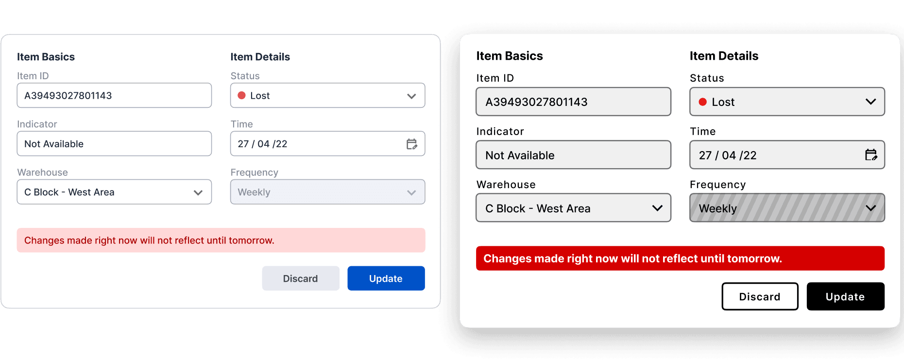
High contrast mode
In our scenario, the implementation of high contrast mode was vital for two primary reasons:


There's an ongoing debate about the effectiveness of high contrast mode when it is haphazardly imposed on an interface that wasn't originally designed to accommodate it. We took a proactive approach and conducted tests and iterations to ensure that it genuinely enhances usability rather than creating potential issues.
Comparison of standard and High contrast mode.
Adapting for different devices
Aim is to reduce design and development time while not compromising on the quality.
Desktop
Since most of our users used the applications on desktop, design was always desktop first. On desktop, a user can open multiple apps at once, moving back and forth for actions and information.
Tablet
One application at once, optimized for screen size, and touch interaction.
Phone
All applications were not required on phone, and the once which are available, didn't need all the features. Each app is typically tailored to address specific and often limited requirements.