Enhancing the UX of tab navigation
Case study
Tab navigation, often overlooked, quietly enhances user experience by providing an accessible and efficient alternative to mouse navigation. It proves to be a valuable tool for diverse user needs, from empowering those with disabilities to offering quick, standardized navigation for power users. In this case study, I explore the tab navigation for the Meijer's design system.
To begin with,
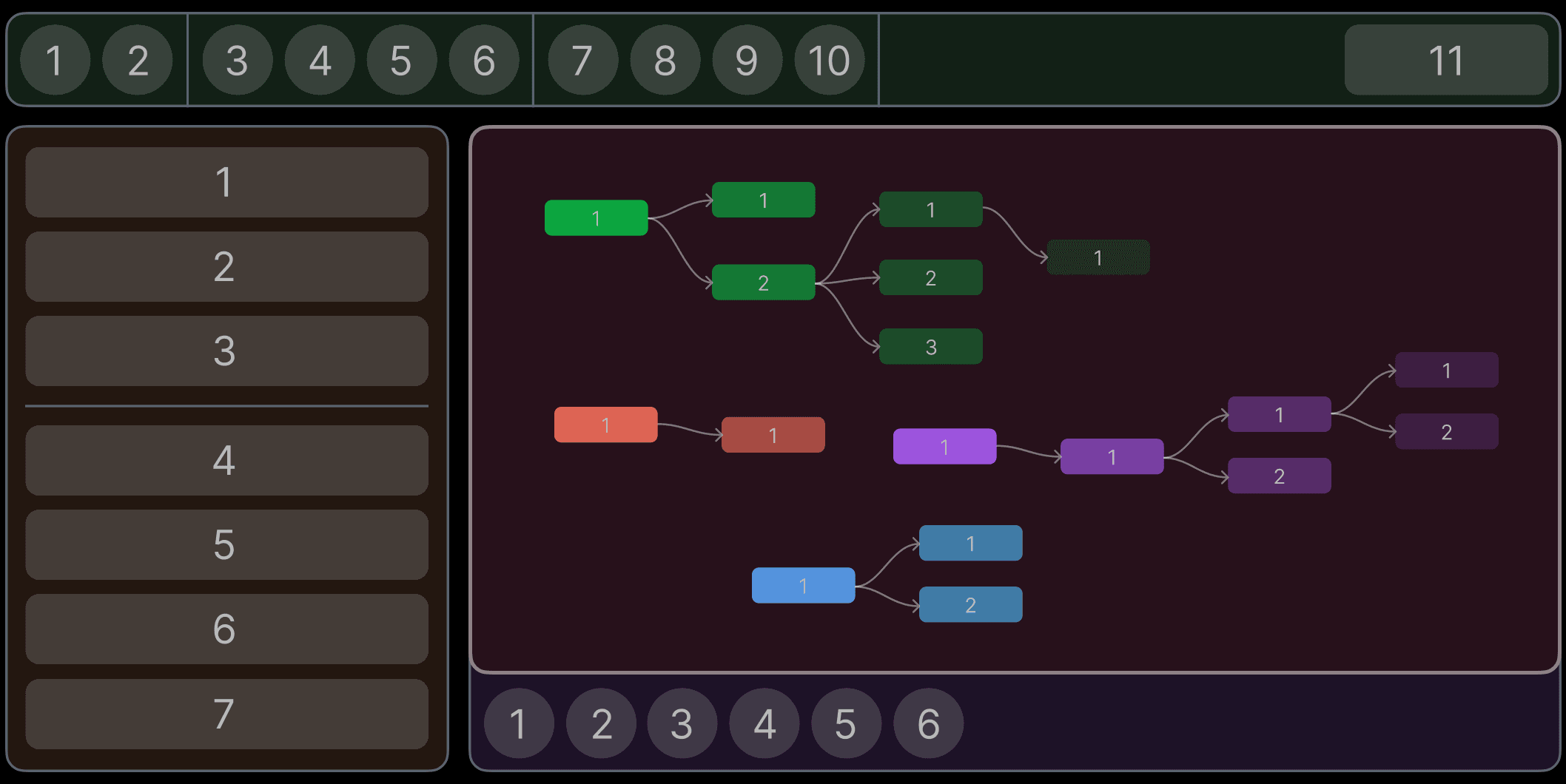
When you move from one component from another, specially in a enterprise application, the number of options consume a lot of time to reach the desired option. Also the sequence of how the selection will jump from one section to another is not the most obvious.

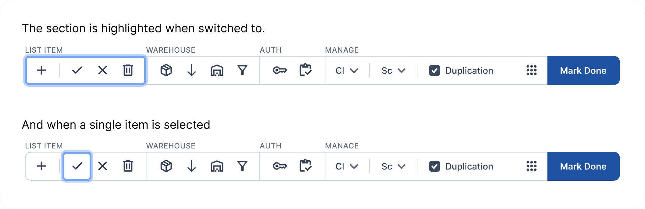
How about adding a section system, where pressing the ALT+TAB will let the user jump from one section of options to another. Now that selecting the second option on the bottom bar is not 20 taps, its just 3 taps.
We could also break down sections of a section, which seems helpful where there are many options divided into group...

But it fails in a scenario where there are much more groups and 1-2 options per group, which is why I did not move forward with this approach.

Where does it break?
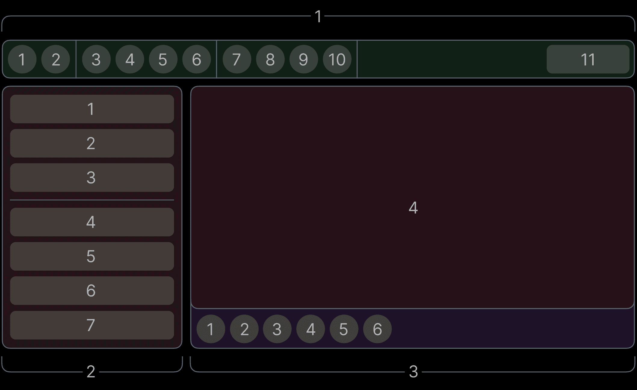
This system works in a linear interface structure, but there are instances where the items are neither in a group necessarily, nor arranged in a linear fashion, such as a node editor which was a part of many of our applications.

But nodes are complex in connections and keep branching, we cannot make it work without adding another layer of grouping in navigation.
There are 2 solutions:
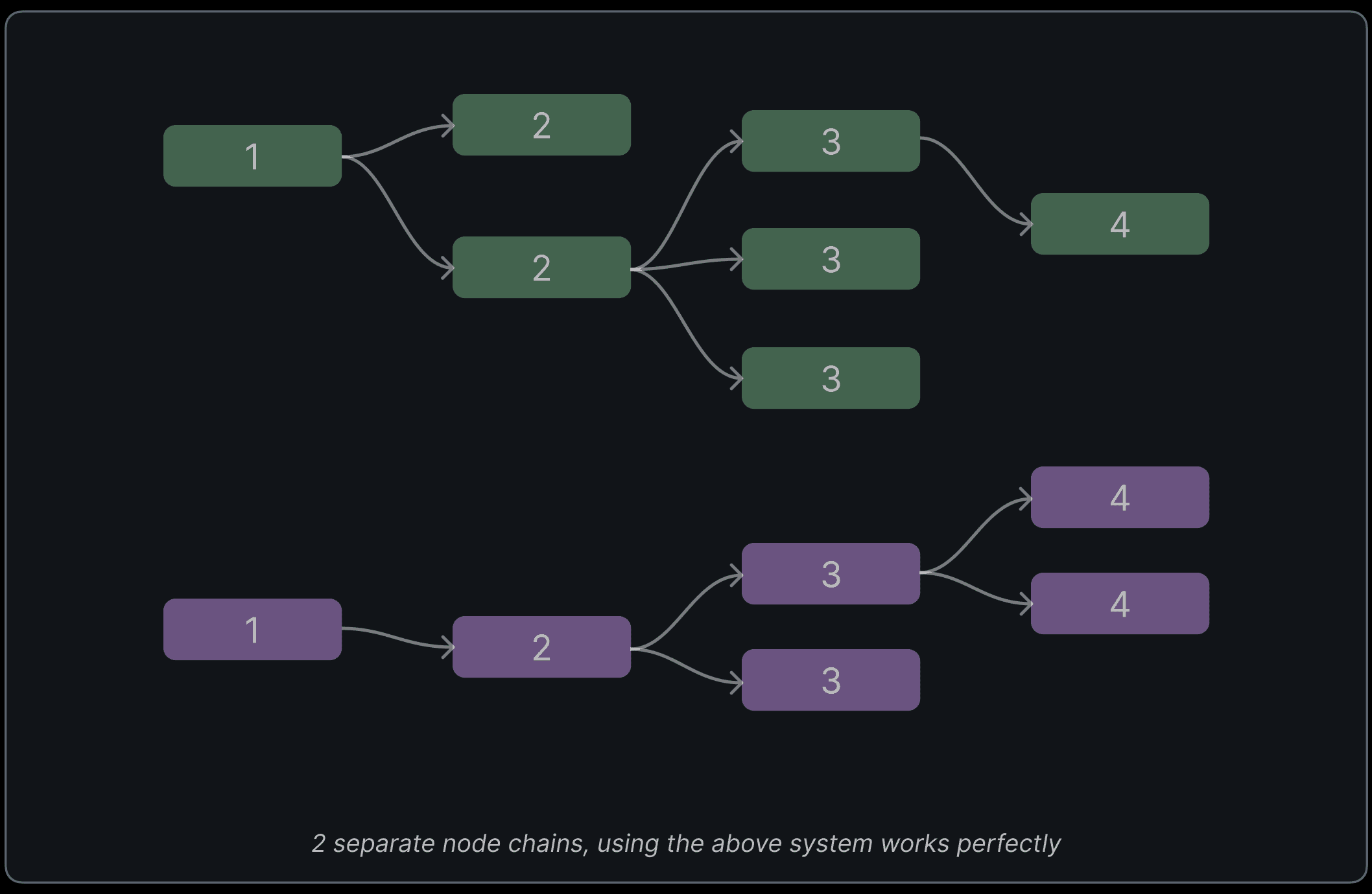
1. Adding the arrow keys to shuffle between branching items, and tab will move steps.
Just using arrow keys to move in all directions based on nearest distance in whichever direction.
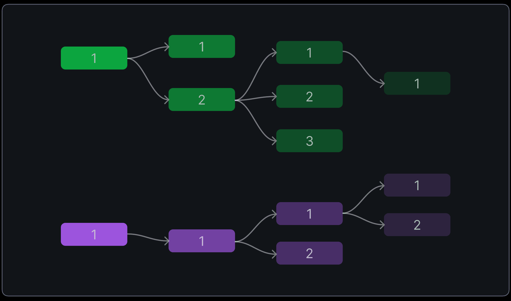
Edge case
Lets zoom out, in our case the user will usually not have more than 1-2 separate node groups, but the problem arises when there are many, selecting a node, moving back to its options on the side panel, and then repeating this action many times, which is very common, this process is still a lot of taps.
For such instances, to speed up the movement without adding another layer of navigation group, there are 2 options. Dedicating a key to switch between the node graph and rest of the sections or adding a long press functionality to the tab key, where at long press, the user can switch back and forth from node graph.
I decided to use the long press since there are already 4 keys just for tab navigation. keeping it simple.